Examples
See different examples of how wec360°s unit finder can be implemented on your website.

Hero
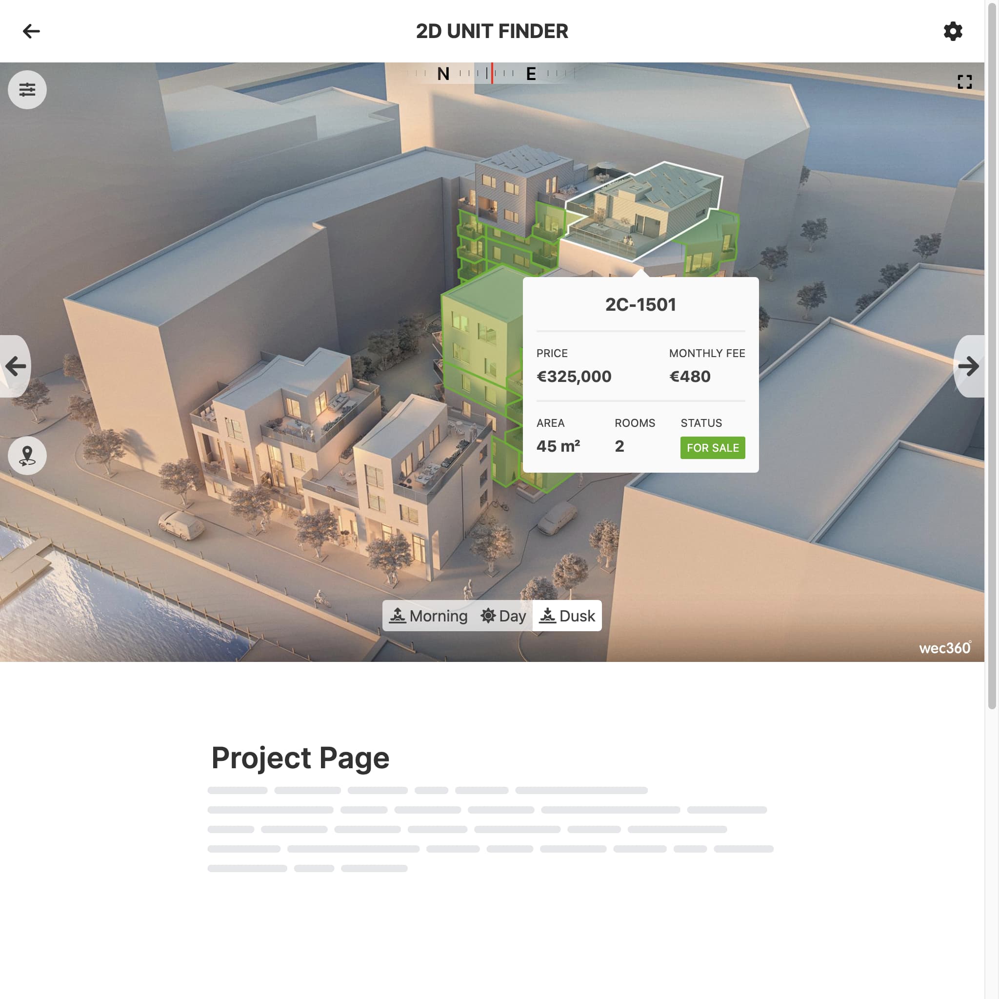
The unit finder is placed as a hero block at the top of the page
This solution works well on a project page where you quickly want to let the visitor get an overview of what is available but also let them scroll on and read more about the project.

Full screen with site header
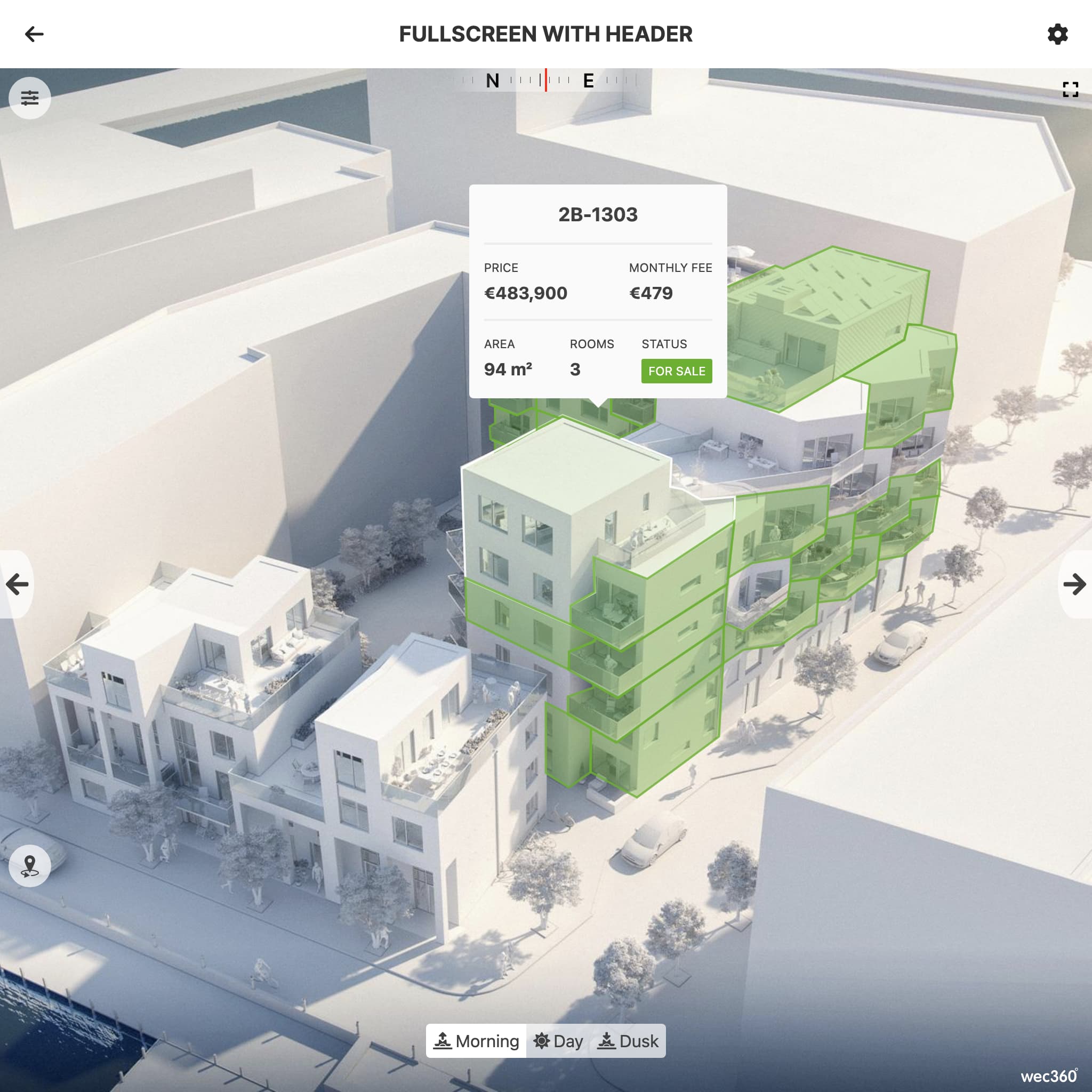
The unit finder gets its own page with your header. It's fully responsive and fills out the rest of the window.
This solution fits well if you want your own page for the unit finder, but still want to be able to have your logo and navigation visible.

Preview button with fullscreen dialog
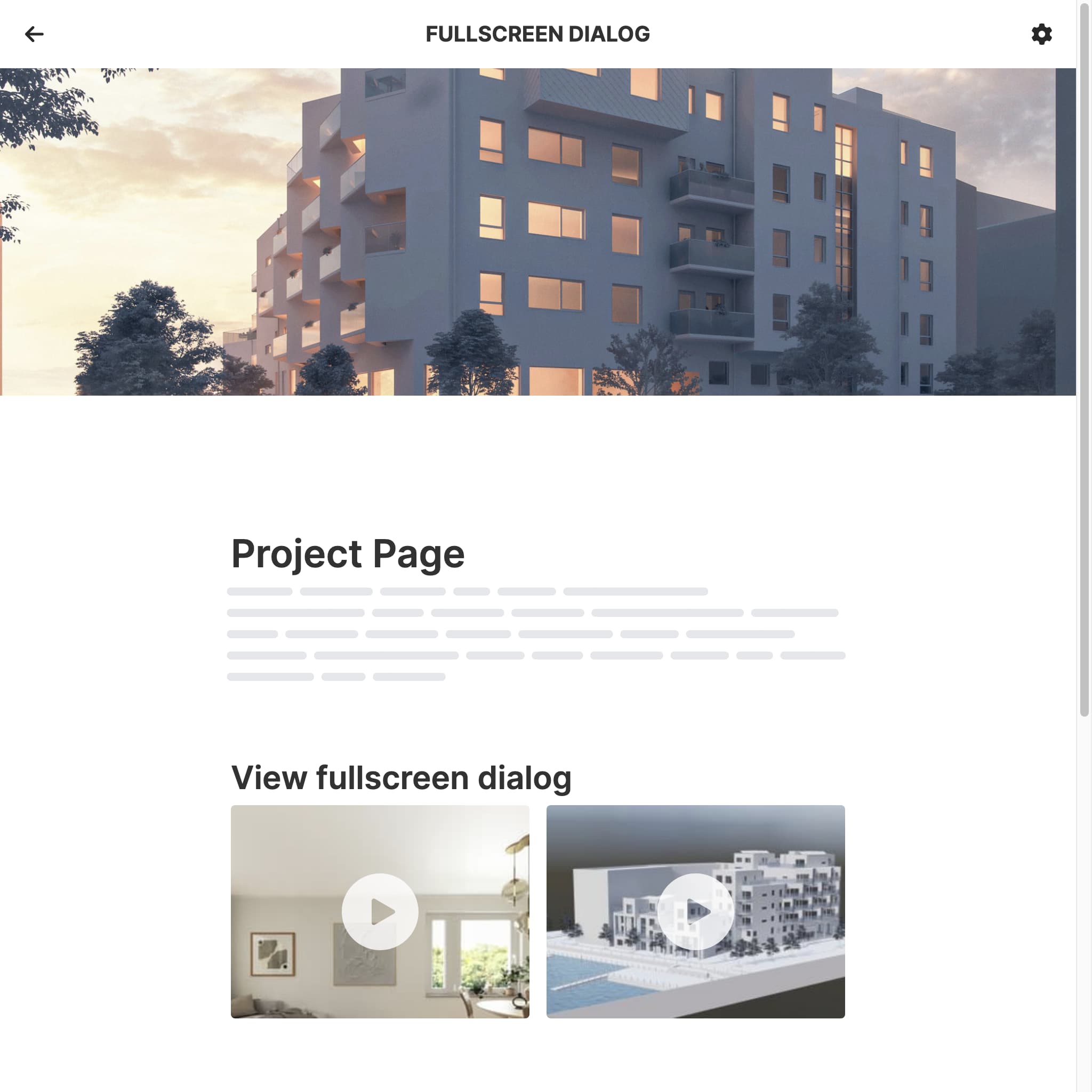
The linked views preview image is shown together with a play button, much like how youtube gets embedded. When clicked it opens the unit finder in a fullscreen dialog.
This solution fits well where you want to stay on your site but want the optimal experience for the unit finder.